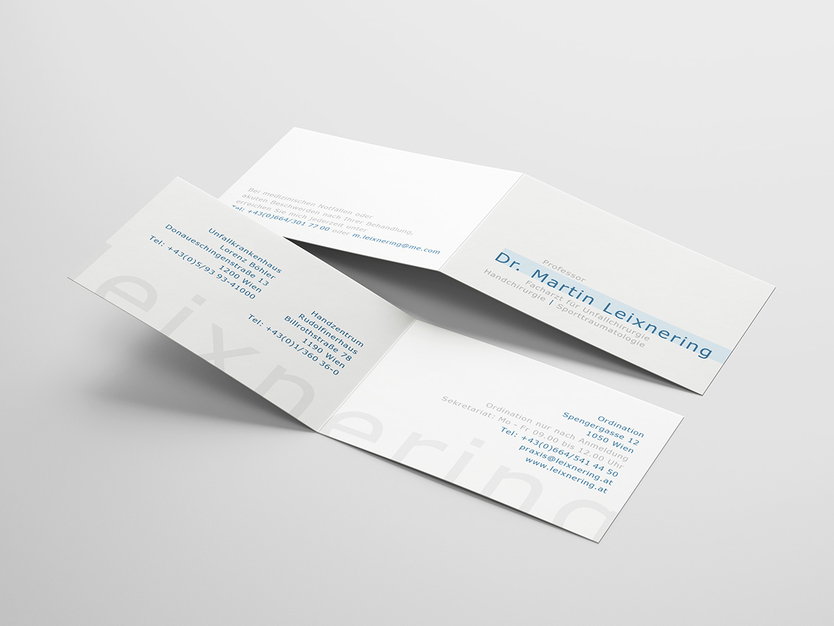
Dr. Martin Leixnering
Specialist in Trauma Surgery, Hand Surgery,
and Sports Traumatology
SHOWCASE
Introducing the typographic brand design for Dr. Martin Leixnering, a distinguished surgeon specializing in hand surgery.
This unique typographic identity captures the essence of his expertise, precision, and dedication to healing hands.
SCOPE
Art Direction, Graphic Design, Web Design
YEAR
2018
MEDIUM
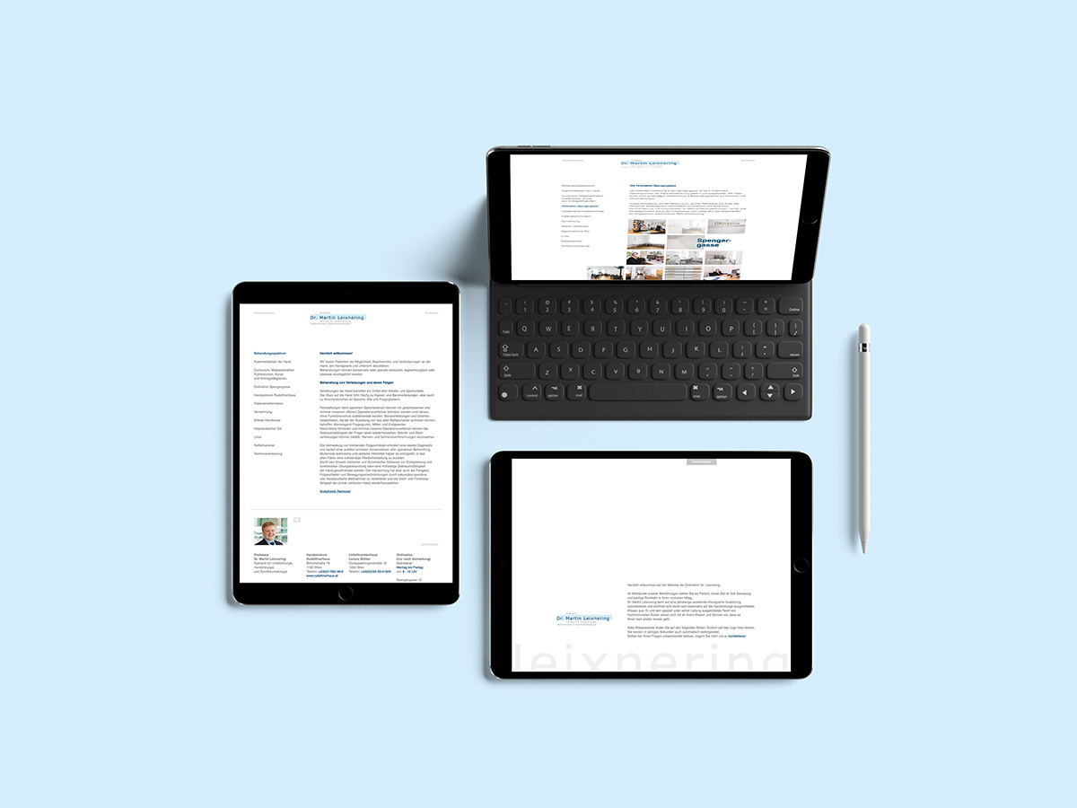
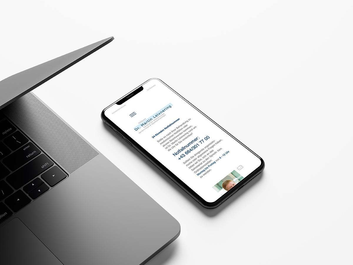
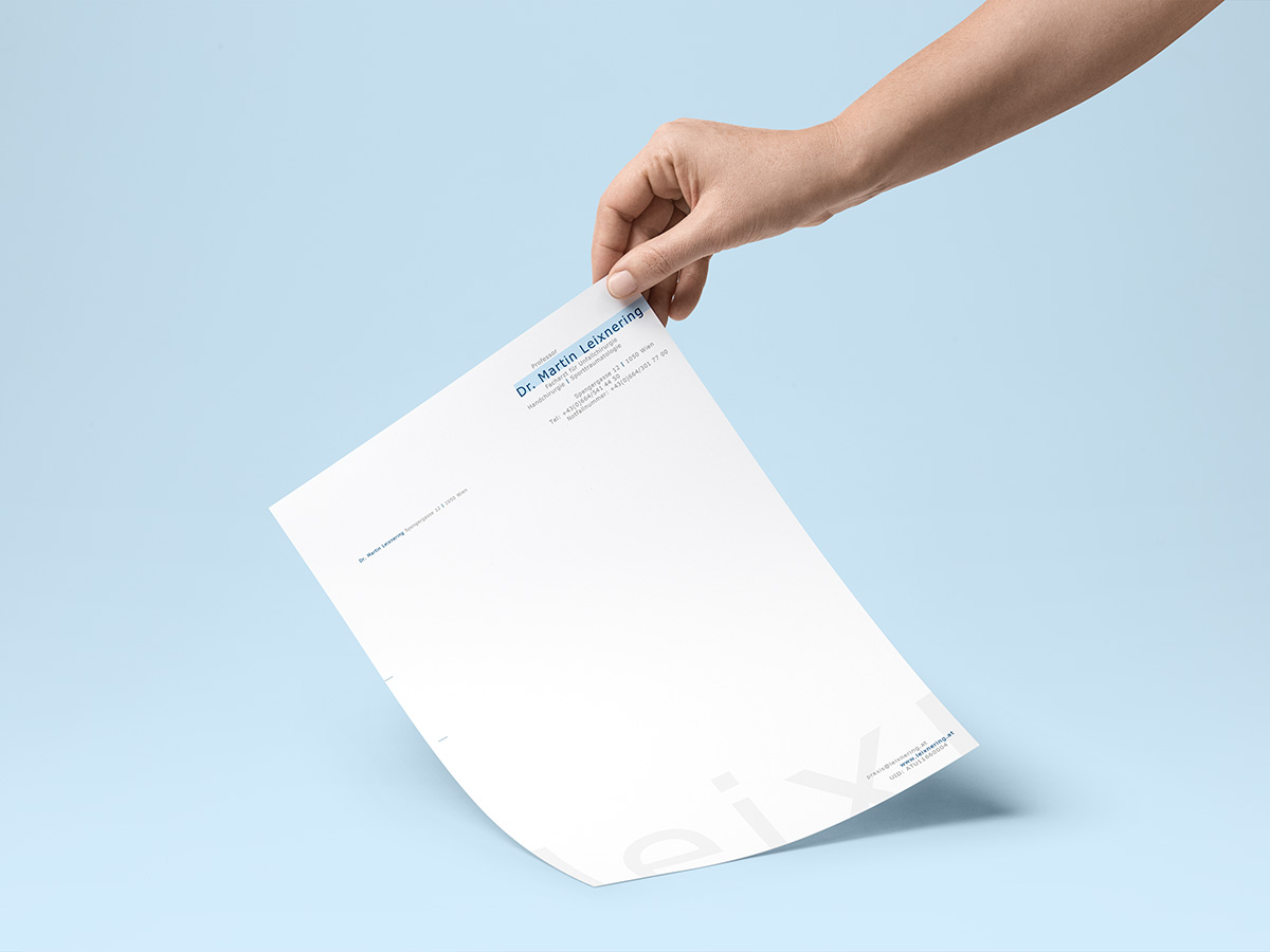
Print and digital assets
ADDITIONAL
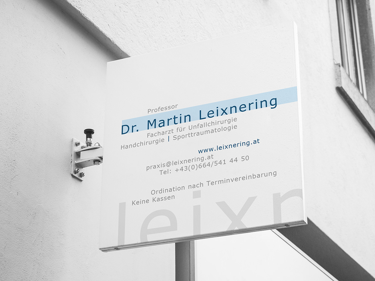
The logo design for Dr. Martin Leixnering utilizes a carefully selected typeface to reflect the delicate nature of hand surgery. The letters are meticulously shaped, with gentle curves and refined edges that evoke a sense of professionalism and attention to detail. The typography is clean, modern, and legible, representing his commitment to clarity and transparency in his practice. The color palette chosen for the brand design conveys a sense of trust, tranquility, and healing.
His brand design establishes a strong visual identity, communicating his expertise, dedication, and compassion. Through this unique brand design, Dr. Martin Leixnering's reputation as a leading hand surgeon is elevated, solidifying his position as a trusted professional in the field.
BUREAU TWELVE
Art Direction and Design Studio
Based in the heart of Austria, working globally
SOCIALS