SMFS Podcast
Shit My Friends Say
SHOWCASE
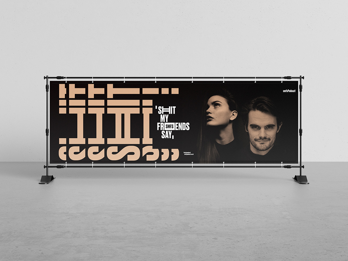
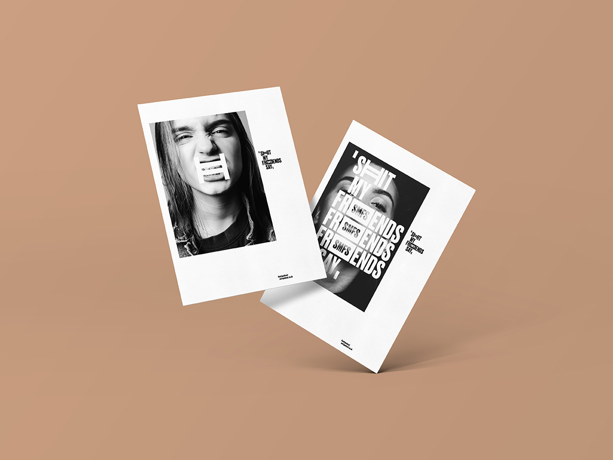
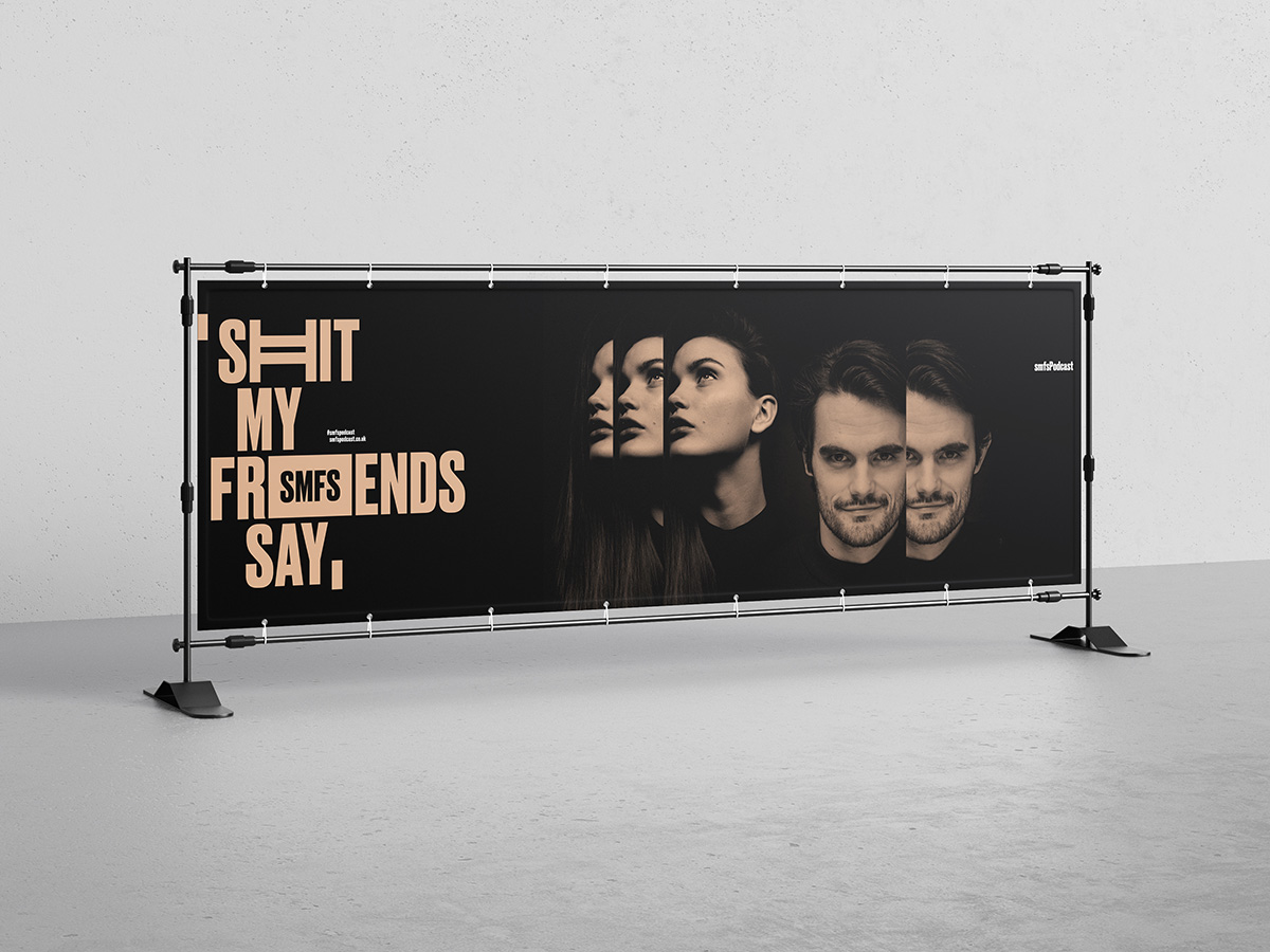
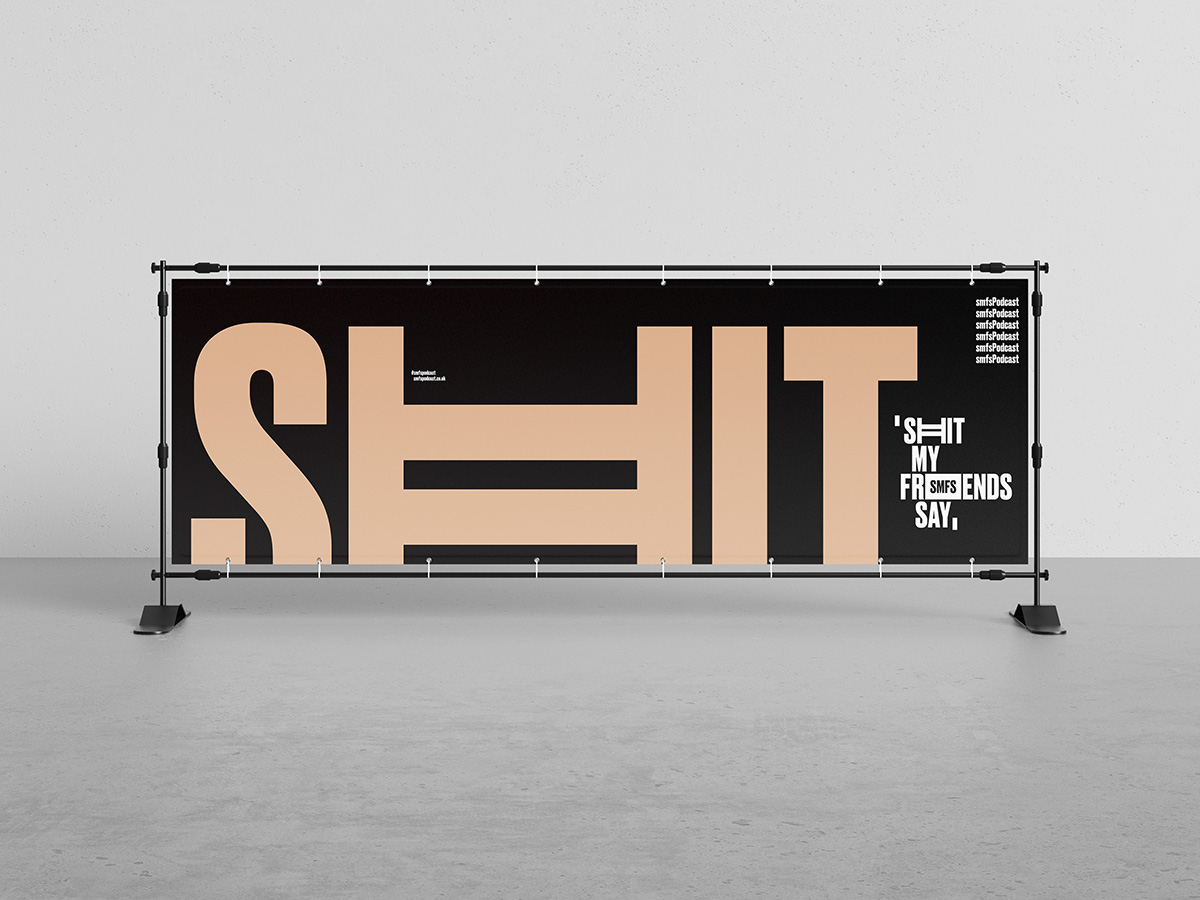
Immerse yourself in the witty and hilarious world of "Shit My Friends Say," a British podcast that captures the humorous and relatable conversations shared among friends.
The typographic design of the podcast embraces a timeless elegance, combining a classic black and white palette with a playful touch of salmon pink.
SCOPE
Art Direction, Graphic Design
YEAR
2020
MEDIUM
Print and digital assets
ADDITIONAL
The typographic design extends beyond the logo to create a cohesive visual identity for the podcast. Episode titles and show notes are presented in a clean and legible manner, ensuring easy readability for listeners. The salmon pink hue is strategically incorporated throughout the design elements, adding visual interest and reinforcing the brand's playful spirit.
This typographic design captures the essence of "Shit My Friends Say" as a podcast that celebrates the humor and camaraderie shared among friends. It effortlessly blends a classic black and white aesthetic with a touch of salmon pink, creating a visually engaging and memorable brand identity. With its timeless elegance and playful charm, the typographic design perfectly complements the captivating conversations and laughter-filled episodes that await listeners of this delightful British podcast.
BUREAU TWELVE
Art Direction and Design Studio
Based in the heart of Austria, working globally
SOCIALS