Wine Label
A design concept
SHOWCASE
Presenting a typographic design concept for a winery. Drawing inspiration from the captivating art of Japanese calligraphy, we have created a visual identity that exudes elegance and sophistication.
SCOPE
Graphic Design, Design Strategy
YEAR
2018
MEDIUM
Print assets (concept)
ADDITIONAL
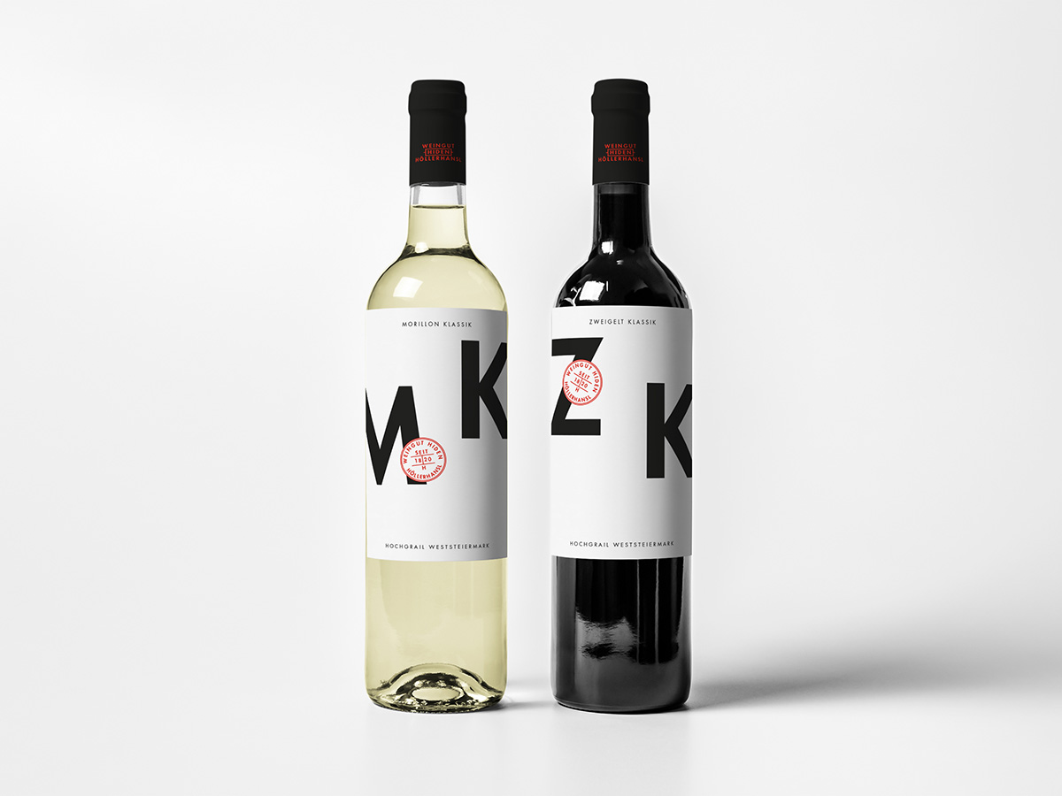
The Grotesque Font we have carefully chosen perfectly encapsulates the essence of the brand. Every letter has been meticulously crafted to reflect the harmonious balance found in Japanese calligraphy.
The minimalistic approach enhances the overall aesthetic, allowing the typography to take center stage. Black and white serve as the primary colors, symbolizing the classic elegance and timelessness associated with fine wines. A touch of red, strategically placed as small details, adds a hint of passion and energy, creating a captivating contrast against the monochromatic backdrop.
By blending the artistry of Japanese calligraphy with the world of winemaking, we have crafted a design concept that evokes a sense of sophistication and allure. The winery's labels embrace the minimalist letters and incorporate the delicate red details, ensuring a cohesive visual language throughout the brand's corporate identity. This ensures that every bottle tells a story and reflects the winery's commitment to quality. Every element has been thoughtfully curated to showcase the unique character of the winery's offerings, making it a visual delight for wine enthusiasts and design aficionados alike.
BUREAU TWELVE
Art Direction and Design Studio
Based in the heart of Austria, working globally
SOCIALS